
When I think of data visualization, I picture graphs in a modern digital presentation or a live comprehensive dashboard where data is easily analyzed for a company’s progress. However, after delving into the history of data visualization, I learned that visual representations of information had deeper roots than I expected. Throughout history, there are many pro’s and con’s to representing data visually. Through my research, I have gained more insights into what makes a successful chart. In “A Brief History of Data Visualization,” Michael Friendly says,
“These roots reach into the histories of the earliest map-making and visual depiction, and later into thematic cartography, statistics and statistical graphics, with applications and innovations in many fields of medicine and science that are often intertwined with each other.”
(Friendly, 3)
Starting with early maps and diagrams to help with navigation using the stars, and continuing on to the development of forms of measurement such as visuals to represent population, land, taxes, etc. In my opinion, the chart below is a very successful chart because it represents the major milestones in the development of data visualization throughout history.
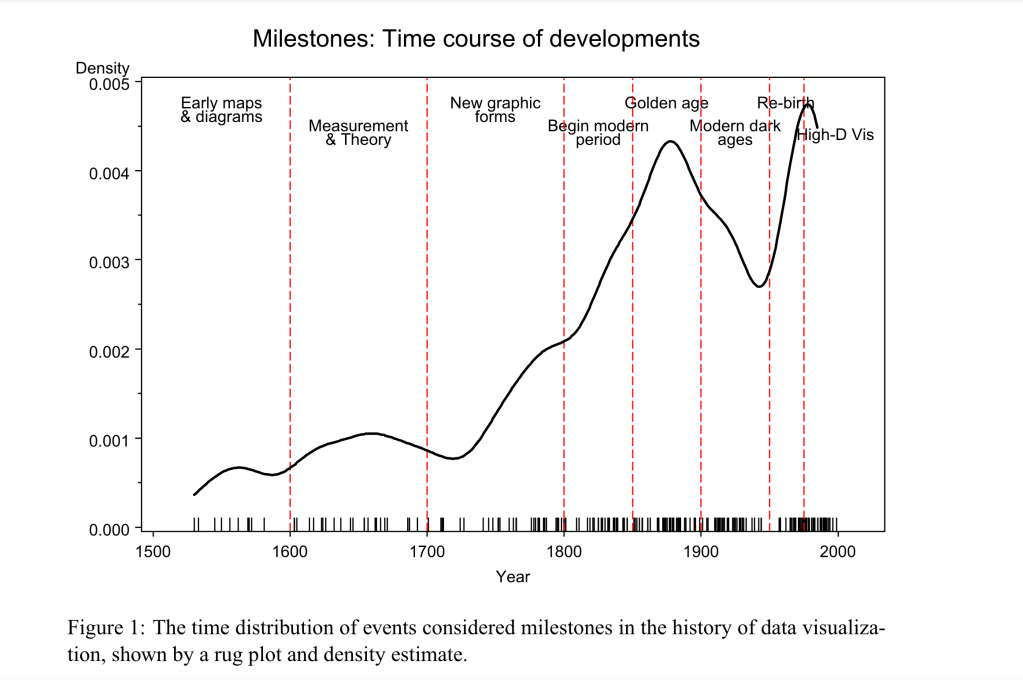
Upon further analysis, you can see a peculiar drop in development during the beginning of the 1900’s. “Data Visualization: A Complete Introduction” helps explain this drop when Heavy.AI explains, “The first half of the 20th Century didn’t see much data driven graphic innovation. Statistical models became the rage, using exact numbers without use of visuals” (Heavy.AI, 2024). This decreasing period of development was known as the “modern dark ages of visualization” (Friendly, 20). Although the chart makes this drop clear, it does not give any context or explanation for the drop. So, why the lack of development during this time period?
The rise of popularity of quantification and statistics was the explanation. During this time, many scientists thought visuals and pictures were “incapable of stating a ‘fact’ to three or more decimals” (Friendly, 20). Therefore, the focus shifted to exact numbers and away from visuals before they realized visuals could accurately represent statistics.
After the 1960’s the rise of computers in the digital age contributed to the steepest increase in history and how easily computers could aid in creating visual representations of large amounts of data.
“Good charts” throughout History
Data visualization tools have been used throughout history to present groundbreaking medical data and some of the examples below are excellent and accurate visual aids. For example, in the 1800’s John Snow created a dot map to represent the cases of Cholera that were clustered around the Broad Street Pump in London. This map was monumental in the discovery that Cholera was a water-born disease, which paved the way to eliminating the disease by determining its source (Friendly, 14). This chart is successful because it clearly shows the outbreak in greater numbers around the Broad Street Pump and could be easily comprehended by the general public.

A more modern example of how data visualization can aid in the history of medical discoveries and statistics is the chart below. The chart below creates some perspective of the amount of deaths caused by major pandemics throughout history. For example, the visual sizes of each pandemic create some persepctive of how many people died of the Black Death compared to the recent COVID-19 pandemic. This chart is attractive and clear in its design and gives lots of context using numbers and showing visual sizes so the viewer can compare the death tolls of each pandemic.

Source: https://www.visualcapitalist.com/history-of-pandemics-deadliest/
The “not so good” charts
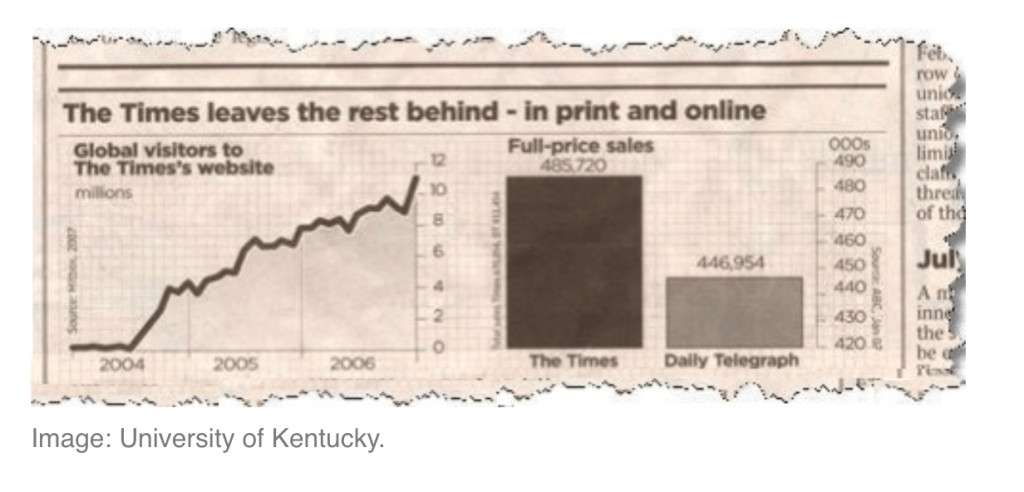
Although data visualization charts have been extremely helpful throughout history, there are some disadvantages to be aware of. For example, the accuracy of data is not always accurately represented in visual charts. In the example below, it looks like The Times makes double the sales as The Daily Telegraph. However, if you look closely at the scale, you can see that The Times is only beating the competition by about 10%.
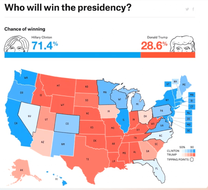
Another example of a misleading data visualization chart is the chart below from the 2016 election. In Giorgia Lupi’s Ted talk on “How we can find ourselves in data“, she points out the inaccuracies of only using two numbers and two colors to represent the false outcome of the 2016 election. There were many other logistical factors that this chart did not include and the chart did not represent the entire picture. She also points out that our data visualization charts need to start including “data humanism”. She uses this chart as an example because it did not include empathy, imperfection, and human qualities in it’s data (Lupi, 2017).
Therefore, in today’s culture data visualization methods are not only used by CEO’s analyzing large amounts of sales or digital advertising data. Many data visualization methods were used throughout history to analyze and educate the general public on major discoveries and milestones. Although data visualizations can be extremely helpful in creating ways to more clearly educate people on large amounts of data, it is important to note that not all data is accurately represented in charts and can easily be misconstrued and biased in certain visuals. The pro’s of data visualization charts far outweigh the con’s since they have been an important educational tool throughout history. However, it is always important to take a closer look at the chart’s details to determine its visual accuracy.
Citations:
Data Visualization – a complete introduction. HEAVY.AI. (n.d.). https://www.heavy.ai/learn/data-visualization#:~:text=Data%20visualization%20is%20a%20graphical,detail%20and%20create%20new%20insights.
Friendly, M. (2008). A brief history of data visualization. Handbook of Data Visualization, 15–56. https://doi.org/10.1007/978-3-540-33037-0_2
Lupi, G. (n.d.). How we can find ourselves in Data. Giorgia Lupi: How we can find ourselves in data | TED Talk. https://www.ted.com/talks/giorgia_lupi_how_we_can_find_ourselves_in_data?trigger=0s&subtitle=en
Misleading Graphs: Real life Examples. Statistics How To. (2024, May 12). https://www.statisticshowto.com/probability-and-statistics/descriptive-statistics/misleading-graphs/
Nicholas LePan. (2023, April 23). Visualizing the history of pandemics. Visual Capitalist. https://www.visualcapitalist.com/history-of-pandemics-deadliest/
The John Snow Cholera Map. City Center – TAU Research Center for Cities and Urbanism | Tel Aviv University. (n.d.). https://en-urban.tau.ac.il/news/snow_cholera_map

Leave a comment