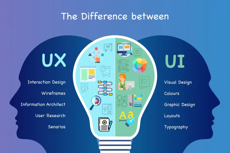
In analyzing the user experience behind two competing websites, the psychology of the user is an integral part of the success of each site. Considering the user experience is all about “understanding the behaviors (ex. pain points) that the users have and approach them if necessary to help design a better experience for them so that ultimately at the end of the day, they will come back to use the products again” (Lee, 2017). In addition, the user interface, which involves the visual aesthetic of the website is also an important factor to recognize when comparing websites. To begin with, Broadway.com and Playbill.com are two competing websites that provide information on Broadway shows and have contrasting user experiences.
Broadway.com
Broadway.com is a website that features all of the current Broadway shows and as you click on each product, you can see more information and purchase tickets. In terms of the user experience, the homepage makes me feel excited and curious because it meets my need to be in the know and to find clarity. Similar to many users, I want to know about the newest shows and this website makes me feel excited to check them all out. In addition, the search function is easy to use and very clear to purchase tickets. All of the product links have a production photo that gives users a sneak peak into the show and to makes them curious to click further.
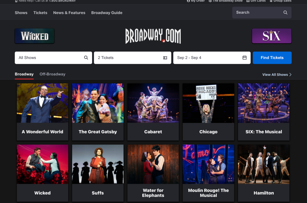
Once I navigate to a specific show page, I feel energetic and stimulated because I can see more photos, videos, and a synopsis of each show that fulfills my need to learn about the show. I also feel excited to spend a significant amount of money on the tickets, which is key to connecting with your audience and growing sales.
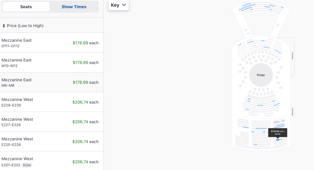
However, their ticketing page is less clear and exciting because it is very unclear which seats and sections you will be purchasing. Similar users can feel frustrated and hesitant because there is not a refund option and they may not know what each section is called. There are also more fees and taxes that are not visible which does not fulfill my needs of honesty and flow to easily purchase tickets.
Although the ticketing page is not the easiest to navigate, the user interface is extremely simple, clear, and consistent throughout the site. For instance, all of the buttons, typefaces, and colors are consistent and easy to understand. According to the Gestalt Principal in psychology that “refers to humans naturally perceiving objects as organized patterns and objects”, users are more likely to respond to symmetry and visuals that look organized and easy to comprehend. (Lee, 2017).

Playbill.com
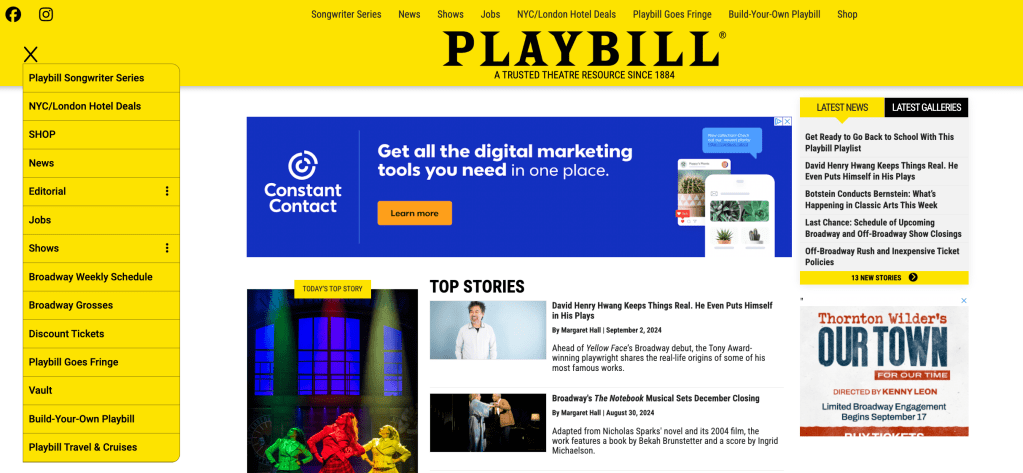
Playbill.com is a competing website that features tickets and information for current Broadway shows. However, the website also has a larger database of information than Broadway.com. As a result, the user experience of the Playbill.com homepage is not as successful. When visiting the homepage, I feel overwhelmed and anxious because it does not meet my needs of harmony and spaciousness. There are multiple menu bars and users do not know which one to refer to and there is too much information crowding the page above the fold.
Understanding human psychologies is an important factor to consider, especially the concept of Progressive Disclosure. According to this principal, users should be given “bite and small chunks of information rather than everything at once at front. The main purpose is to lower the chances that users will feel overwhelmed by what they encounter” (Ish∆n, 2020).
However, Playbill.com’s show page has a much better user experience. First of all, the way that the shows are formatted makes me feel satisfied and encouraged to look for tickets to see a show because it fulfills my needs for choice, spaciousness, and flow. All of the shows are evenly spaced, organized, and consistent in their show posters and typefaces. The carousel at the top helps users interact with the shows. Kyle Peat published data that proved that carousels were effective at engaging visitors, which can keep them on the site for longer and increase conversion. (Weinschenk, 232).

Finally, Playbill.com’s user interface makes me feel annoyed and fatigued because it does not meet my needs of understanding and ease. In addition to having four navigation bars, some of the advertisements block parts of the navigation bar on mobile, which makes me frustrated that I cannot get to the desired page. The buttons are also very inconsistent in size and the homepage is visually busy and overwhelming.
Therefore, although Playbill has a strong show page, I would still choose Broadway.com to purchase my tickets due to their user experience. The whole process is much simpler and less overwhelming. However, Broadway.com is not perfect and has some adjusting to do on the ticketing page to make the user feel more confident to purchasing tickets at each price point. Playbill.com may have a plethora of information to share, but adding it all to the homepage doesn’t necessarily create a better user experience because it can be overwhelming and difficult to navigate. Paying attention to how the user will react and process information will create a stronger connection with customers and ultimately lead to more engagement and conversions.
Click HERE to see the full website analysis.
Citations:
Lee, G. “GB.” (2017, April 5). Having a psychology background is already a huge step towards user experience (UX). Medium. https://uxplanet.org/having-a-psychology-degree-is-already-a-huge-step-towards-user-experience-ux-235c072f9002
Ish∆n. (2020, October 8). The psychology of UX design. Medium. https://uxdesign.cc/the-psychology-of-ux-design-859439bc8a32
Weinschenk, S. (n.d.). 100 things every designer needs to know about people. Goodreads. https://www.goodreads.com/book/show/10778139-100-things-every-designer-needs-to-know-about-people

Leave a comment