
In order to create a successful persuasive argument using data, there are many factors that come into play. Instead of presenting an audience with statistics or facts, “stories have proven to be more persuasive and memorable than statistics alone” (Marchese, 7). This is because the art of information design uses storytelling to balance visual communication with human connection. Humans are more likely to believe and comprehend statistics when in a story format than statistics because the information becomes more engaging, relatable, and easier to understand how different variables connect. In Storytelling and Visual Cues, Courtney Marchese says,
“By combining data with narrative, we give the audience something to interpret, compare against their current belief systems, and consider insights (Marchese, 7).
Marchese is elaborating on the fact that instead of reacting to hard statistics or facts, people are more likely to respond to storytelling. This is due to the brain being more engaged, connecting to explanations, and provide more details that produce empathy to see additional points of view. Because storytelling can be so relatable and engaging for the reader to connect with, it can also be very powerful in the art of persuasion.
The Cherry-Picking Effect
Cherry-picking is a common method of persuasion when presenting only selective information in a visual story. It is challenging to find and produce accurate persuasive visual representations, especially when many of them ony include selective information. Cherry-picking involves selecting and presenting only the evidence that advances the presenter’s point of view (Tufte, 144). For example, usually the first published study in a medical report is the one that is most widely found but not necessarily the most accurate since many studies revealing more information subsequently appear (Tufte, 144).
A good way to recognize a cherry-picking is when it sounds too good to be true and it appears as a single report without a series of following reports. There are also many biases and evidence selection that are prevalent in many public data visuals which can persuade readers to only see one side of the story. Solutions to inaccurate data include consumers of evidence staying “reasonably close to primary sources and to evidence-interpreters who provide unbiased opinions” (Tufte, 155).
Persuasive Examples
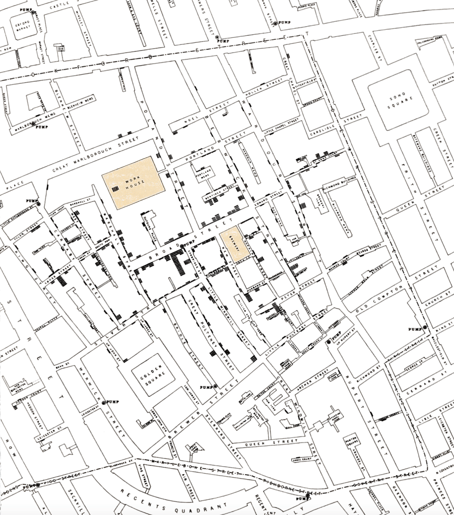
One of the most famous persuasive dot maps in history is John Snow’s Cholera map that illustrates the cause of Cholera in relation to the Broad Street pump. The visualization convinced and educated many people that Cholera was spread through contaminated water as presented through increased cases by the Broad Street pump. Although his map publicized the method of transmission of the disease, there are some inaccuracies that prove this map was biased and not entirely accurate.
First of all, the individual death’s were shown on the map but did not include the death rates of the entire society. Most importantly, the dot map did not take into account the number of people living in the area. An area may have remained unaffected because there was a smaller population living in that area. However, John Snow’s data was an example of clearly illustrating one point of view and persuading many people to sanitize their drinking water to eradicate the epidemic.
Chartjunk
“Chartjunk” is a term that was coined by Edward Tufte to describe the extra visuals that distract the viewer from the actual information being communicated. By adding in extra pictures, noisy backgrounds, or other superfluous imagery, the attention of the reader is attracted to the distractions and not necessarily the text or overall message. This is a common method of persuading readers to only see certain points.
In Beautiful Evidence by Edward Tufte, he says, “Chartjunk flows from the premise that audiences can be charmed, distracted, or fooled by means of content-free misdirection” (Tufte, 152). In other words, Tufte speaks very negatively of extra colors, corny clipart, and phony dimensionality that take away from the information being presented. However, Chartjunk can be manipulative and persuade viewers into distraction or confusion instead of the information being presented.
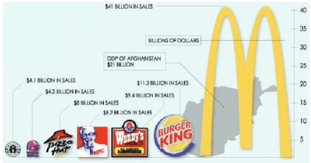
One example of chartjunk is the graph below that includes so many extra clip art graphics that it takes away from seeing the actual numbers of each fast food restaurant. The extra colors make the data difficult to process at first glance as well.
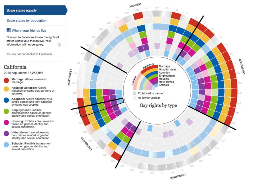
Another example of chartjunk is the chart below on gay rights. The graph is so full of multiple colors that it is hard to decipher which color means what. The colors are distracting and it is hard to recognize any patterns or trends.
Therefore, there are many ways data narratives can be persuasive and manipulative. Including only sections of information that support the point the presenter is trying to make is a way of using the cherry-picking effect to persuade viewers of a specfic point of view. Using chartjunk to fool the viewer and purposely provide content-free distraction is another persuasive device to detract from the information at hand. Ultimately, in order to absorb the most accurate information, the reader must firstly always question the source, determine if all information is included, and identify distractions that take away from the general messaging of a visualization.
Citations:
Mannon, N. (2022, January 25). Persuasive storytelling with Data Visualization: Blast Analytics blog. Blast Analytics. https://www.blastanalytics.com/blog/persuasive-storytelling-with-data-visualization
Marchese, C. Storytelling and Visual Cues [PowerPoint presentation]. https://quinnipiac.blackboard.com/bbcswebdav/pid-6300870-dt-content-rid-76454210_1/xid-76454210_1
Tufte, E. R. (2019). Beautiful evidence. Graphics Press.
Tufte, E. R. (1997). Visual explanations. Graphics Press.

Leave a comment