
When you look at a map, do you ever question its accuracy? Maps are made for different purposes and audiences. They aren’t always as accurate as we think. As Mark Monmonier says in How to Lie with Maps, the common map reader understands that maps are bending the rules of reality because they are adapted to scale. However, the common reader does not realize how misleading some maps can be. For example, some can include inappropriate projections or a misleading set of symbols (Monmonier, 2). A map’s scale, projection, and symbols can all represent accurate data but there is still a large margin of error within those realms.
For instance in “Why all world maps are wrong,” Johnny Harris says, the surface of a sphere cannot be represented as a plane without some form of distortion” (Harris, 2016). The video shows that a sphere of a globe is impossible to be flattened without all of its elements being stretched or distorted. Although modern maps use the Mercado projections in smaller more zoomed in versions that make it appear less distorted, there are still many discrepancies in flat maps of the world.
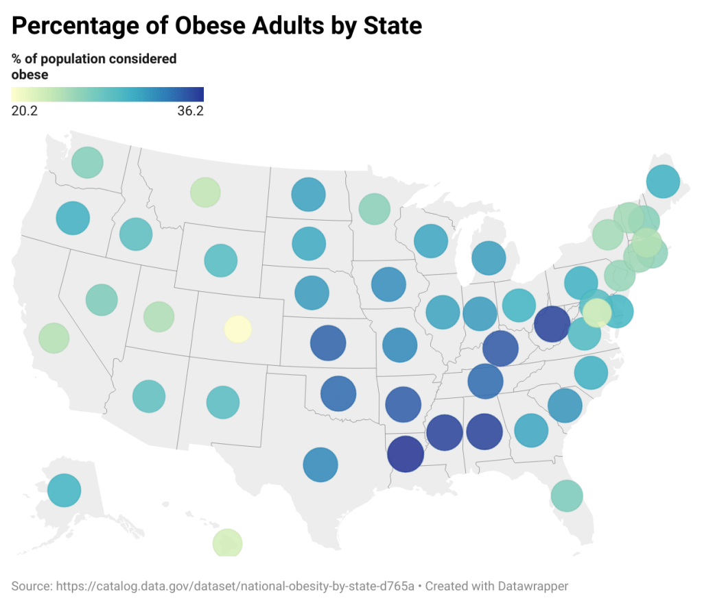
Choropleth Maps
Although some maps may appear less accurate or more biased than others, there are many different types of maps used to show patterns and trends. Some can appear more clear than others and some can also appear more persuasive. Choropleth maps use shades of color and work very well to clearly show a pattern in geographical data. They also work very well to show one variable. For instance, in demonstrating the percentage of adults who are obese by state, the choropleth map below works very well as a data visualization. This is because the reader can easily see the states with the largest percentages in a dark color and the smallest percentages in a light color. For example, Colorado is very clearly the lightest shade and has the smallest amount of obese adults in the country.

Symbol Maps
However, a symbol map can also be used to show data by using the size of symbols to represent data with geometric shapes. The example below does not illustrate the amount of obesity percentages very clearly because the data is so close. You can see that Colorado has a smaller dot than Louisiana, but the size does not show a drastic enough contrast for the eye to easily see. A solution would be to make the data in a smaller or larger proportion so that it looks more contrasting on a symbol map. However, the reader will mostly look at the shade of color instead of the symbol size here. For instance, this map is meant to show contrast between states and it looks like the size of most symbols is the same, which can be an example of how this map would be misleading.
Locator Maps
Locator maps use maps to show where multiple data points are located. I used the world population overview to collect some more information on the top ten most obese states. In order to give a better visual of where these main states are in relation to each other to find patterns, I used a locator map.
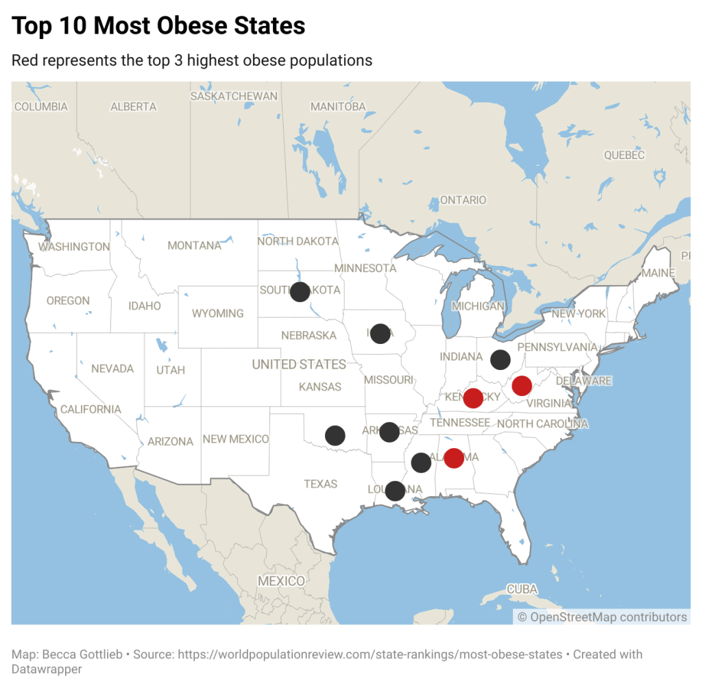
This map is helpful in seeing a handful of locations and highlighting them to analyze the relationship and similarities between them and the surrounding states. You can infer from the visualization that the highest concentration of obese populations are in the middle of the country away from coasts, bodies of water, and any mountainous regions. With the red highlights of the top three most obese states, you can compare the relationship of the southern states that have the highest obesity rates in the country. West Virginia, Kentucky, and Alabama are all relatively close to each other geographically and you can further analyze the similarities of these similar states incuding their similar physical regions, food consumption traits, and cultural habits.
Although there can be inaccuracies in different types of maps as well as biases spreading misinformation through maps, there are some very strategic types of maps to demonstrate different points of view. In order to recognize specific geographic patterns and compare the trends of specific areas, choropleth, symbol, and locator maps are all beneficial in portraying that information. Depending on the type and range of data, each type of map can help to clarify patterns in the clearest way possible . However, the only way to determine the best visualization map is to explore the data and see which makes the most sense for the point of view that is being visualized.
Citations:
Harris, J. (2016, December 2). Why all world maps are wrong. YouTube. https://www.youtube.com/watch?v=kIID5FDi2JQ&t=2s
Most obese states 2024. (n.d.). https://worldpopulationreview.com/state-rankings/most-obese-states
Monmonier, M. S. (2018). How to lie with maps. The University of Chicago Press.
SusitnaVisions. (2019, September 19). 21st century mapping: An 8 part series ; part 1: All maps lie. Natalie Treadwell. https://susitnavisions.com/2019/09/02/the-new-map-an-8-part-series-part-1-all-maps-lie/

Leave a comment