There are a variety of ways to get around New York City. The most common modes of transportation are cars or public transit. However, both of those methods are not energy efficient. Other energy efficient options include walking, biking, electric Citibikes, electric scooters or skateboards. During a span of two weeks, I recorded some data of how I traveled around New York City to see how much I am utilizing energy efficient modes of transportation. I recorded details such as the amount of time each method of transportation took, how many trips I took each day, and how much money I spent on each method.
In “The Beauty of Data Visualization“, David McCandless refers to data visualization as magical. He believes that visuals made from data is easily absorbed and is effortless to analyze. He says that we are so responsive to patterns and visual keys which makes data visualization so successful (McCandless, 2010). Therefore, because my project has themes of nature and promotes energy-efficient transportation for our environment, I chose to create a data visualization in the shape of a tree. I used different patterns and colors in the leaves to illustrate different data points. For instance, I used the stems in each leaf to represent five minutes of travel time.
I started with notes on my phone to remember how much travel time and how expensive the travel was, converted it to visual symbols, and then created a drawing of a tree with leaves to create a visual of all of the data. I used many different shapes on each branch to represent different types of transportation and used different lines and shadings to represent the pricing and amount of time it took for each trip. Below are a few iterations of the data collection before I came to the finished product. It took some trial and error to find the right colors and symbols that was appropriate and clear for each variable and mode of transportation.
Two-Week Analysis
New York City is a challenging city to get around for everyone due to its size and sheer amount of people. Based on my findings over the past two weeks from July 13 – July 27th, I have taken a total of 75 trips away from my home. The amount of time I have spent on these trips totals 30 hours and 40 minutes. That’s a lot of travel time in two weeks! I spent $120 in total on all transportation. However, only $30 was spent on electric vehicles and the other $90 was spent on non-energy efficient transportation. I spent 13 hours and 15 minutes on non-efficient transportation and 61 hours and 45 minutes on energy-efficient transportation.
I found that I used a mixture of energy efficient electric vehicles and non-energy efficient gas powered vehicles. The majority of my trips were taken on my electric scooter for shorter trips and I used gas powered vehicles for longer trips. I initially expected that my data would be extremely energy efficient because I use my electric scooter and e-bikes so often. Although each individual trip was longer by a non-efficient transportation, I spent more total time on energy-efficient vehicles over the two weeks. Therefore, my hypothesis was correct that I spend more time on energy efficient vehicles and the cost is cheaper than gas powered vehicles like cars and trains. The major surprise was how much time I spend traveling in general…it was a lot more time than I expected.
Just as McCandless pointed out, the visual representation of data gave me a much easier analysis and ways to identify clear patterns and trends. For example, the larger leaves with more outlines represented more expensive trips. It was very clear that the gas powered trips such as non-electric cars, trains, and ferry’s were more expensive than the electric powered vehicles.
Further Data Collection
This was only one sample of my life in the past two weeks which involved many variables because of the time of year. The data involved summer trips, changing to a new job, and the summer season weather that affected the way I traveled due to the heat. If I were to do this again, I would take the data from a more consistent point in my life or over a longer span of time. Normally, I would take the subway more or even ride a bike that was not electric. However, because of the heatwave last week, I changed my normal choice of transportation.
In order to have a more clear representation of typical New York City transportation, I would ideally pulled from a handful of data from other commuters in New York City. My choices to use electric bikes, electric cars, and electric scooters is a personal preference and probably not the normal trend of New York City residents. I actively choose not to use the subway due to the heat and safety concerns and use more cars and Metro-North trains instead. Although I thought I was using more efficient electric transportation for short term trips, I still used gas-fueled transportation for longer trips that equals more harmful fuels into the environment for longer periods of time.
Citations:
McCandless, D. (n.d.). The beauty of Data Visualization. David McCandless: The beauty of data visualization | TED Talk. https://www.ted.com/talks/david_mccandless_the_beauty_of_data_visualization?subtitle=en
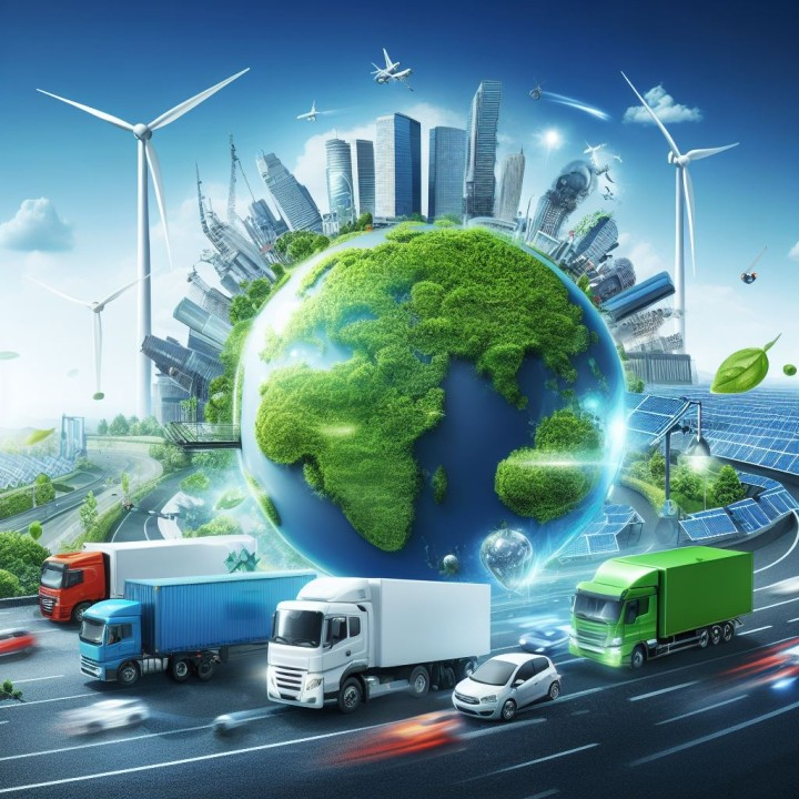
Aslam, M. U. (2023b, October 2). Energy-efficient transportation modes for Greener Logistics. LinkedIn. https://www.linkedin.com/pulse/energy-efficient-transportation-modes-greener/

Leave a comment