
Statistics and numbers are not the only mediums that can be represented through data visualization. There are many ideas and concepts that can be displayed through a data visualization chart without any exact statistics. In Good Charts by Scott Berinato, he says, “Either you’re visualizing concepts and qualitative information or you’re plotting data and information” (Berinato, 56). He is referring to conceptual data visuals and data-driven visuals. Within those two categories, there are declarative and exploratory visualizations. Declarative visualizations represent information you have to present and exploratory visualizations represent what you are looking for such as patterns or emerging trends (Berinato, 57).
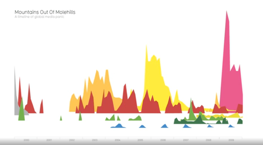
For example, David McCandless in “The beauty of data visualization” points out specific patterns that can be observed through data visualizations. In the below graph of global media panic from different irrational fears, he points out the gap in 2001 due to 9/11 can be easily observed. He also points out that the violent video gaes fear has a twin peaks pattern. This is due to copy-cat shootings or anniversaries of the actual events that cause a second surge. Both are patterns that were observed strictly from the visual patterns that would have been otherwise missed in a data spreadsheet.
Conceptual-Declarative
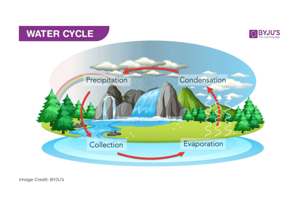
When a data visualization chart is defined as “conceptual-declarative”, it is referring to a visualization that simplifies complex ideas and creates visuals with existing information. For example, these can be manifested in circles, hierarchies, pyramids, and other common shapes that act as easy to understand metaphors. (Berinato, 58). An example of a conceptual-declarative visualization is the water cycle chart below. The chart represents concepts of evaporation and condensation and not specific quantities. It also represents concrete conceptual information that is being conveyed to the viewer.
Conceptual-Exploratory
Another way to present qualitative information is by using conceptual-exploratory visualizations. When you have concrete concepts but want to further explore and compare trends and patterns, conceptual-exploratory visualizations is an insightful tool. Visuals often help people understand concepts and allows them to easily find useful patterns (Biswal, 2023). This is a great tool for idea generation and design thinking.
By using conceptual-exploratory visualizations on a white board in a group brainstorm, companies can more easily foster innovation and “remain competitive in a rapidly changing environment” (Design Thinking, 2024). For example, during a design sprint, putting many ideas, predictions, and patterns in a visual pattern is a successful method to identify and implement new ideas. The chart below is an example of conceptual ideas put into an easy to understand visual. It demonstrated different ideas to explore and compare in one chart in order to clearly determine patterns and trends.

Data-Driven-Declarative
Data-driven-declarative visualizations present existing quantitative data. These are most often standard charts from data in simple forms such as “line charts, bar charts, pies, and scatter plots” (Berinato, 66). Viewers rely on common conventions for easy comprehension such as higher numbers being physically higher on a chart and reading left to right in our western culture. An example of a successful data-driven-declarative chart is below. It takes existing numbers of movie sales and creates a visual of the highest grossing movies of all time.

Data-Driven-Exploratory
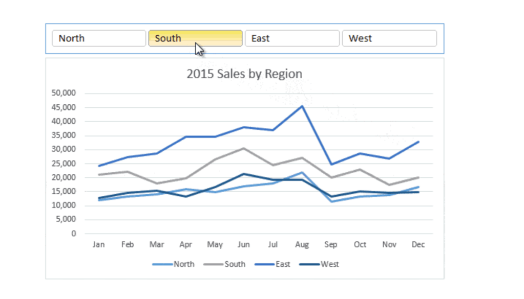
Quantitative data can also be presented in an exploratory method in order to determine patterns or explore solutions. These types of visualizations may combine multiple data sets and can often be dynamic or interactive to update in real time (Berinato, 62). Interactive data-driven-exploratory charts can be extremely efficient in viewing combinations of data with different outcomes depending on different choices a company makes. The chart below is an example of a data-driven-exploratory chart because the viewer can toggle between sales in different regions and explore the data by comparing each region’s productivity.
Although there are many different types of data visualization methods for qualitative and quantitative concepts and statistics that can be interactive or static, all types of charts should be visually accurate. Whether you have conceptual data or numbers, all of the visual representations should show accurate comparisons and patterns without skewing the visuals to show only a small percentage or inaccurate perspective. However, accurate data visualization methods can be extremely helpful in making large amounts of information clear, exploring different outcomes in an interactive medium, or demonstrating concepts and ideas clearly.
Citations:
AFFiNE. (2024, April 18). 10 best whiteboard layout ideas to boost your productivity in 2024. Medium. https://medium.com/@affineworkos/10-best-whiteboard-layout-ideas-to-boost-your-productivity-in-2024-da66d661c8dc
Berinato, S. (2023). Good charts the HBR Guide to making smarter, more persuasive data visualizations. Harvard Business Review Press.
Biswal, A. (2023, February 17). What is exploratory data analysis? steps and market analysis: Simplilearn. Simplilearn.com. https://www.simplilearn.com/tutorials/data-analytics-tutorial/exploratory-data-analysis
Highest grossing movies – bar graph. SmartDraw. (n.d.). https://www.smartdraw.com/bar-graph/examples/highest-grossing-movies-bar-chart/
Interaction Design Foundation. (2024, June 11). What is design thinking? – updated 2024. The Interaction Design Foundation. https://www.interaction-design.org/literature/topics/design-thinking#:~:text=Involving%20five%20phases%E2%80%94Empathize%2C%20Define,are%20ill%2Ddefined%20or%20unknown.&text=In%20his%202009%20TED%20talk,in%20solving%20extremely%20complex%20challenges.
McCandless, D. (n.d.). The beauty of Data Visualization. David McCandless: The beauty of data visualization | TED Talk. https://www.ted.com/talks/david_mccandless_the_beauty_of_data_visualization?subtitle=en
Solaja1. (2022, July 9). Module Two: The four types of information visuals. Sola’s Thoughts. https://solasthoughts.com/2022/07/09/module-two-the-four-types-of-information-visuals/
Treacy, M. (2019, March 13). Interactive excel charts. My Online Training Hub. https://www.myonlinetraininghub.com/interactive-excel-charts

Leave a comment