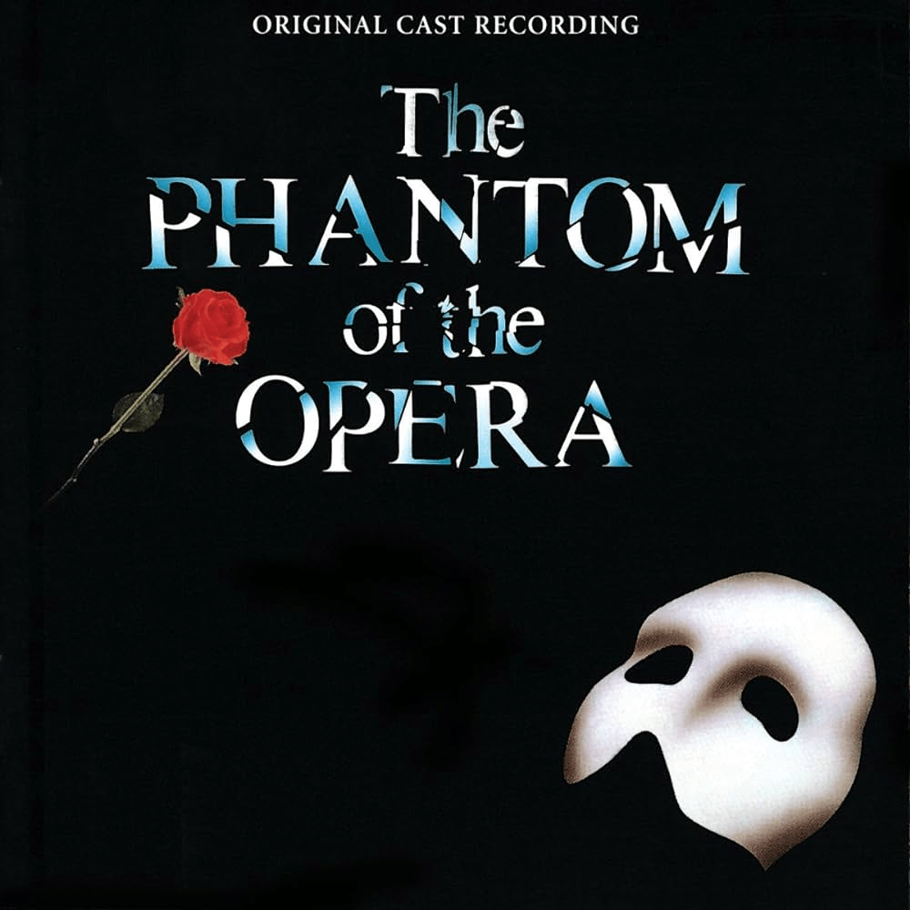
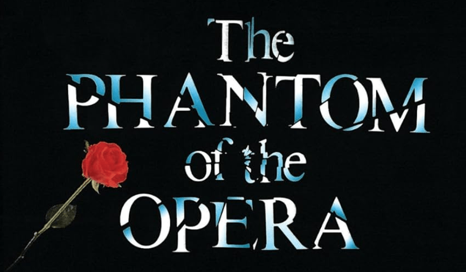
Just as a logo is essential to a company’s branding, for a Broadway show or movie, the key art represents the show’s identity and image to its potential audience. Key art is defined as the artwork used in posters, print or digital advertising for movies or Broadway shows. For example, The Phantom of the Opera‘s key art is ingrained into everyone’s mind’s as the show’s iconic image. The image of a mask is an integral part of the show’s branding and a large reason why it was so successful in communities around the world. In “Designing Memorable Key Art: Setting the Stage for Effective Theatre Marketing“, Jillian Dougherty says,
“Having top-notch key art is the single most important aspect of your publicity. It gets people excited about a show, but it also speaks to the quality of the production. If your key art looks homemade and unsophisticated, or too busy, the audience will get the sense that the show will be second-rate.”
(Dougherty, 2024)
Similar to having a logo that is too busy or amateur looking, a Broadway show or movie’s key art can make or break the show’s success. All brand development starts with research and understanding the values, goals, and pillars of a company before exploring any logo or key art development. In “The History of Logos“, Karla Lant & Kelly Morr say “much of the symbolic design work throughout recorded history is all about communicating identity visually” (Lant and Morr, 2017). Finding a visual representation of a show or movie’s values helps an audience connect to the brand and ultimately convert to purchasing a ticket.
The Importance of Color
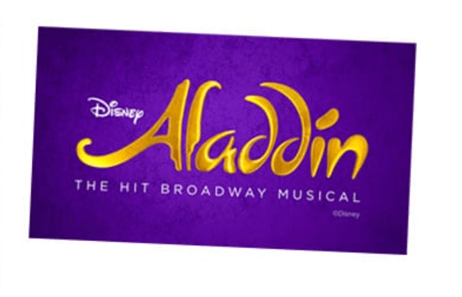
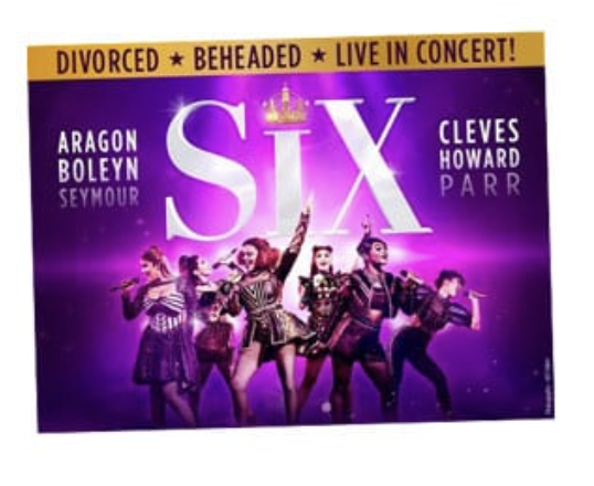
Because people have cultural associations and emotional impressions from colors, the color of key art is extremely important. In “Breaking Down Broadway Key Art“, Holly Reed describes the color purple as usually being “associated with creativity, luxury, and spirituality. It can have a soothing effect and is often used to create a sense of sophistication and elegance” (Reed, 2023). For instance, the key art in Aladdin uses purple to exemplify elegance, luxury and magic when its paired with the gold lettering. Purple is often uses to connote royalty and it is used in SIX’s key art to represent the empowering wives of Henry VIII in the musical.
.
Typeface
A brand’s typeface can give so much context to an audience before even reading the title. Sometimes, typeface can be the entirety of the logo or key art because it is so memorable and appropriate such as Aladdin. Another example of an iconic typeface is The Phantom of the Opera’s shattered design that gives a nod to theshattering chandelier that everyone remembers from the production.
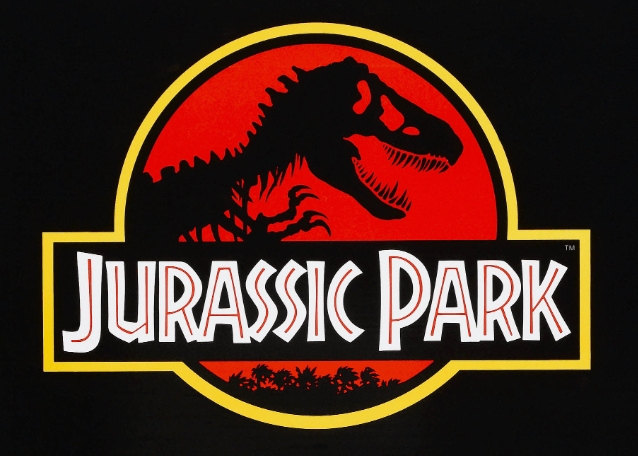
One more great example of successful typeface is the Jurassic Park key art below. The typeface mimics prehistoric lettering and gives the key art a primal feeling to communicate the setting of the movie.
In Graphic Design for Everyone, Cath Caldwell describes typeface selection perfectly when she says, “every typeface has its own personality and projects a specific character – choose wisely to set the right mood and tone for your design project” (Caldwell, 51). Choosing the right typeface for a new project can make or break its success depending on people’s reactions and first impressions.
Hidden Gems
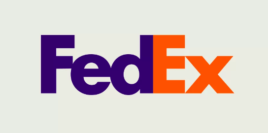
Even though creating an initial logo or key art may be time consuming, incorporating subtle details in a creative way can make it even more successful and timeless. For example, the Fedex logo below has a hidden arrow disguised in the text. This communicates speed and precision, some values that the company represents.
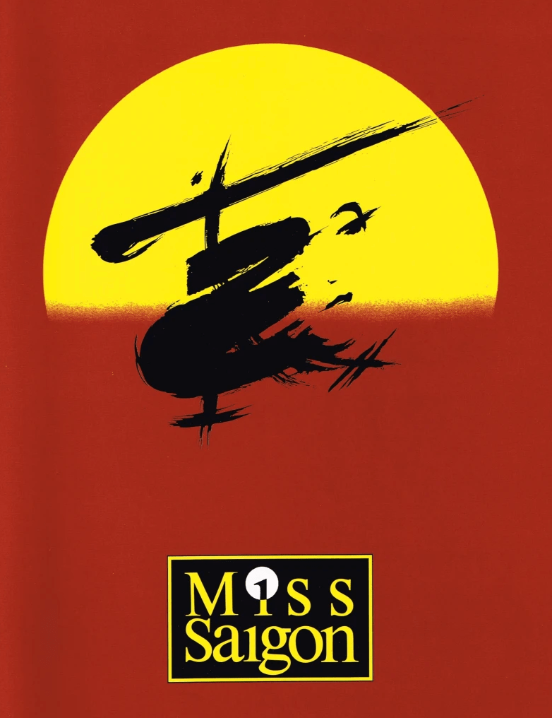
The same concept can be applied in a show or movie’s key art such as the musical, Miss Saigon. This musical is a love story about an American GI and Vietnamese prostitute during the Vietnam War. The key art has many different hidden gems t hat are creatively woven into the design. At first glance, the key art image below is reminiscent of Asian calligraphy. Upon further inspection, it also resembles a helicopter, which is a part of the iconic ending of the show. On the right side, you can also see the hidden image of a woman’s face, which depicts the protagoist of the show.
In “The Woman in the Helicopter,” Dominic Grijalva says, “This heavy, romantic, and tragic image serves as an effective marketing tool as well as a link to some of the most well-known moments in the show. An entire experience symbolized by four colors, a circle, and some scribbles” (Grijalva, 2018). This key art is simple and effective, yet so complex in it’s medium with hidden themes to communicate the show’s message.
Whether you are developing your own logo for a new company or building key art for a movie, the same core principals apply. For effective visual representation, your key art must be clear, bold, stand out, and should send the appropriate message of the company/show/movie you are advertising. Without even realizing the association, many people are attracted to brand recognition when making a purchase. The more memorable you can make the art by communicating the brand’s message visually, the more likely someone will be interested in spending money on your product. Brainstorm and experiment so you can find the best visual representation of your product’s true value.
Citations:
Caldwell, C. (2019). Graphic design for everyone. Dorling Kindersley Limited.
Dougherty, J. (2024, May 8). Designing memorable key art for effective theatre marketing. Trillion Creative. https://trillioncreative.com/designing-memorable-key-art-setting-the-stage-for-effective-theatre-marketing/
Grijalva, D. (2018, August 15). The woman in the helicopter. The Art of Making Art. https://domgblogcom.wordpress.com/2018/08/13/miss-saigon/
Lant, K., & Morr, K. (2017). The history of logos. Vistaprint Ideas and Advice US. https://www.vistaprint.com/hub/the-history-of-logos
Reed, H. (2023, March 16). Breaking down broadway key art: Color. MusicalWriters.com. https://www.musicalwriters.com/marketing/breaking-down-broadway-key-art-color/

Leave a comment