“Humans are hardwired to respond to visual order”
(Caldwell, 162)
This is a quote from Cath Caldwell’s Graphic Design for Everyone where she is explaining the importance of alignment in a design’s composition. As I stare at this blank blog post with no visual order before typing this introduction, I’m wondering if I need to explore some some pre-planning to start this post. Just as a writer needs to brainstorm, create mind maps, and jot down ideas before creating a story, a designer needs to put their ideas on paper in the same way.
In “The definitive Guide: How to make your first wireframe” Rosie Allabarton says, “There’s nothing worse than a blank piece of paper, so you need to start getting your ideas down pronto—that’s the imperative for step three. Don’t think about aesthetics, don’t think about colors—the UI designer can deal with that” (Allabarton, 2023). Even if the ideas need to go through multiple drafts, at least visually seeing your ideas on a screen will inspire more ideas and give you a visual reference to kick start the design process.
The Grid
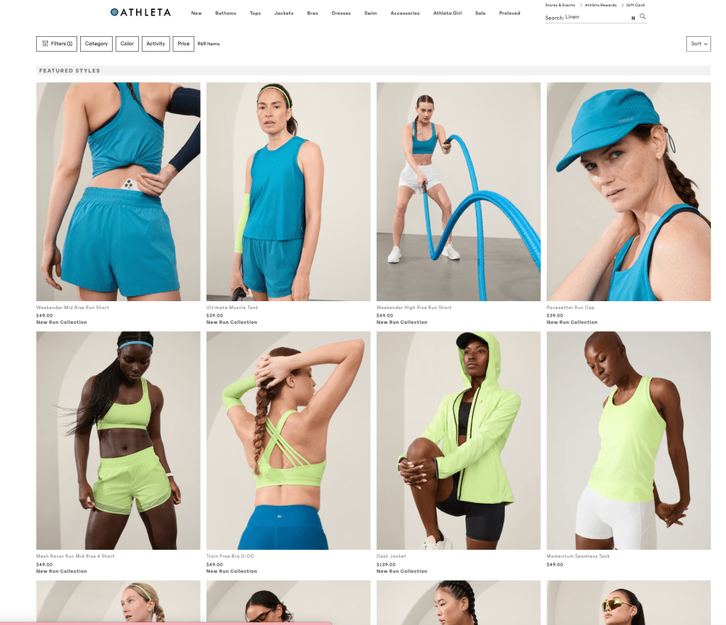
If you are still staring at a blank sheet of paper or digital art board like myself, a great place to start is selecting what type of grid will work best for the project. Caldwell points out, “By establishing rhythm and pace, the grid helps the audience find the same type of information over a number of pages and also means that you can work faster and more efficiently” (Caldwell, 158). Determining whether multiple columns, a single column, or a modular grid is right for your design will take a few attempts using trial and error. A very literal example of how a grid can be used on a website is Athleta’s website with all of the items lined up in columns of four.

Starting with a grid can influence how your text and images will be aligned. Caldwell also says, “aligned elements generally look more visually attractive on a layout – and the more engaged viewers are, the more likely they are to be receptive to your message” (Caldwell, 162). Therefore, starting with a grid and choosing how your content will be aligned is not only helpful at the starting point of your design, but makes the final product look more visually cohesive.
Wireframes
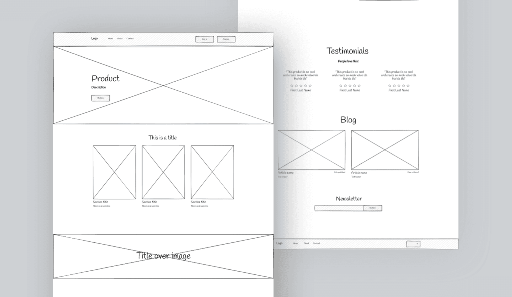
When designing a website or newsletter, A wireframe is the perfect visual game plan tool to map out your ideas. Wireframes map out how your content will be organized and are a great visual reference on showing how each section and page will connect (Caldwell, 177). However, as Allabarton points out, this is only a tool for the main concepts and organization and is not a place for details.
“A good, thick marker pen (a Sharpie, as our friends in the US call them) is a handy tool for this stage of wireframing. Why? Because it prevents you from drowning yourself in detail. You’ll focus on delineating the functional blocks that form the skeleton of your design.”
(Allabarton, 2023)
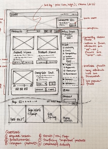
I think this is a great tip to get your ideas down and organize them without getting suck on details or design problems that you can solve at a later time. Wireframes can be created on a computer and be very basic like the example on the left or they can be sketched out with lots of content like the example on the right.


Whatever your chosen design is, wireframes should serve as a tool to yourself for your own creation process or they can be used as a tool to show clients the design plan before pouring time and money into a full design.
What I’m Working On
This week, I created a newsletter and website for my friend’s Yoga company. The company involves lots of stretching, meditation with a focus on wellness and mindfulness. Therefore, I used many calming blues with a pop of pink for the founder who is bright and cheerful. I used Mailchimp and Illustrator for the newsletter and website respectively. In the example below, I used Mailchimp’s template that created a grid for me where I inserted images, headers, buttons, and text. Then, the program aligned everything using its own internal grid so everything as aligned and visually satisfying.
Although Mailchimp does the layout for you, the grid system helped me in Illustrator with my website design. I used a grid system of rows and columns of three. I used the gridlines on Illustrator to line up all of my sections and make it aesthetically easy to read in the website below.
I thought the wireframes initially helped me create an idea of the layout, but I thought just playing around with different photos in the actual design gave me more creative inspiration. By using different photos and literally using trial and error, I found that it was a more inspiring process and gave me more ideas to the layout than using a wireframe. The wireframes helped me map out the navigation and where all of the buttons and links would lead on the website. This way, I knew what was necessary to include on the homepage.
However, I understand the value in wire framing when pitching ideas and designs to clients. This way, clients can see the visual design without spending time and money going into details on a design where the client want to go in a different direction. After my brainstorm process of throwing photos and text around a canvas, the wireframe was ultimately helpful in determining the most efficient and visually pleasing alignment. I am a very visual person and grids and wireframes are both very helpful tools in determining what layout will be most successful. Next time you have a blank canvas and don’t know where to start, a few gridlines and boxes is a great first step.
Citations:
Caldwell, C. (2019). Graphic design for everyone. Dorling Kindersley Limited.
Allabarton, R., Rosie. (2023, May 10). How to create wireframes for a website [with examples]. CareerFoundry. https://careerfoundry.com/en/blog/ux-design/how-to-create-your-first-wireframe/
Leave a comment