When exploring the symbolism of different colors, our own cultural values can affect the interpretation. For example, it is a very common understanding in the United States that red is interpreted as love, heat, or an alert. However, in Cath Caldwell’s Graphic Design for Everyone, she points out that in South Africa, the color red can have a different meaning when it is worn by mourners (Caldwell, 72). Just because one color means something in the United States does not mean that it transfers that meaning around the world.
In “Color Theory for Designers, Part 1: the Meaning of Color“, Cameron Chapman gives even more background to the color red around the world when she says,
Outside the western world, red has different associations. For example, in China, red is the color of prosperity and happiness. It can also be used to attract good luck. In other eastern cultures, red is worn by brides on their wedding days. In South Africa, however, red is the color of mourning. Red is also associated with communism.
(Chapman, 2021)
In addition, the color yellow is used as a mourning color in Egypt where it is used to represent happiness and sunshine in the United States (Chapman, 2021). When one country interprets red as an alert and another country interprets it as mourning or communism, how do you create global unanimity in your global brand?
The Global Color Checklist
90% of first impressions are based on color. The chart below found in “Global branding: The meaning of colors around the world” in Acolad is a great reference to check your brand’s colors to make sure all global interpretations are aligned. (Acolad, 2023).
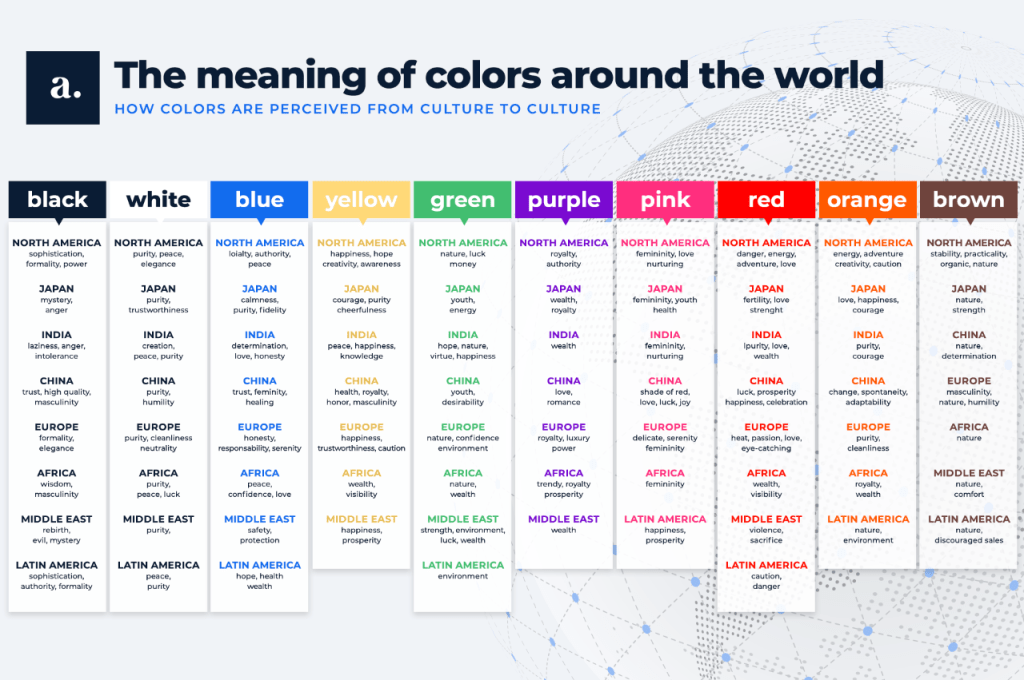
If you are starting a business and create initial creative, you often don’t think of the international growth at the start. However, it’s important to think of this expansion in the future to make sure your creative does not give the wrong connotation internationally. This checklist is a great place to start.
In “Best Practices: How to Use Color in Global Marketing“, Nataly Kelly says that half of the top 10 global brands use blue logos. Blue is an extremely popular color for major international brands. In many countries, words such as “reliable”, “peaceful”, “hope”, and “safety” are used to describe the color. All of these are positive connotations and generally would not create any issues with the symbolism in different countries (Kelly, 2010).
In summary, Kelly does not recommend avoiding colors because of their negative connotations in certain countries. She suggests using the colors in the right context will be more successful in a global expansion. She says, “For example, while red has negative attributes in some contexts, choosing it for a ‘buy now’ or other call to action is acceptable for nearly any target market.” Overall, her recommendation is to use colors strategically in the right context and they will generally be perceived correctly (Kelly, 2010).
What I’m Working On
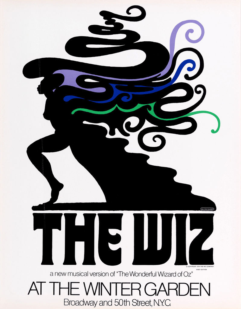
After doing research on Milton Glaser, whom I have never heard of, I had no idea how much of his work I was familiar with. Ironically, I went to see a revival of The Wiz on Broadway this week and I had no idea that he created the original logo. I think his style of a silhouette in black and white combined with a burst of color works so perfectly with the story of The Wizard of Oz where Dorothy begins in greyscale and walks into a world of technicolor in Oz.
I have never used Adobe InDesign or Adobe Illustrator before and have very little photoshop experience. Although creating the designs were very challenging because it took a lot of time to understand the programs, I had the most fun with playing with color.
In InDesign, I designed a VERY simple poster for an ice cream party in my office building and I used a harmony of hues in the first two and then used a contrasting pair of purple and yellow across from each other on the color wheel. This would be considered a contrasting pair where “the colors at opposite points of the wheel are complementary” (Caldwell, 76). The third option really made yellow text pop against the purple across the color wheel. I’ve never thought of pairing yellow and purple together until it was pointed out on the color wheel but it is important to recognize which shade or purple and yellow are used when text is involved so the colors do not vibrate against each other and make it hard to read (Caldwell, 76).
Although I could have designed a much more complex poster in Canva, I wanted to use the time to learn InDesign. I would probably choose the blue hue version because it gives the most chilling, cool, winter vibes appropriate for the theme of the event.
In my Milton Glaser exploration, I used Adobe Illustrator to create a variety of color versions of a unicorn. Although the program was very challenging to use with no experience using it, our class Zoom session was extremely helpful in the step-by-step instructions. I created a unicorn aimed for an audience of children. I created the first two designs with colors next to each other on the color wheel and made sure to make them bright for children. Then, I created a very pigmented and bright version of all of the colors of the rainbow on the third, which stood out to me the most because of the contrast of all colors and its vibrance.
The fourth picture was the first version I created as a trial and decided to include it for fun because I really enjoyed the pastel color combination by adding a lot of white to all of the colors. I thought it was a helpful example of how changing the tint in rainbow colors can alter the entire mood and make it seem more retro instead of childlike.
I had a lot of trouble creating straight and even lines with a mouse, but I guess on screen drawing is an acquired skill to keep working on. Although the technical design part was challenging this week, one of the most valuable skills I was looking for in this course was to learn how to use the Adobe suite and I’m slowly becoming more comfortable using the programs.
Citations:
Global branding: The meaning of colors around the world. Acolad. (2023, February 10). https://www.acolad.com/en/services/global-marketing/international-colors-meaning.html
Caldwell, C. (2019). Graphic design for everyone. Dorling Kindersley Limited.
Chapman, C. (2010, January 28). Color theory for designers, part 1: The meaning of color. Smashing Magazine. https://www.smashingmagazine.com/2010/01/color-theory-for-designers-part-1-the-meaning-of-color/
Kelly, N. (2010, November 30). Best practices: How to use color in global marketing. Chief Marketer. https://www.chiefmarketer.com/best-practices-how-to-use-color-in-global-marketing/

Leave a comment