Whenever I click on the font dropdown menu to select a typeface, I swiftly scroll through each option until I find one that is aesthetically pleasing. Although I may do this subconsciously, I have never really considered the meaning and messaging behind a typeface. After watching Mia Cinelli’s TedX Talk video, I was thoroughly inspired to analyze my typeface selection process when she described typefaces as inflections. Just like how an inflection sends the intended message in dialogue, typefaces have their own inflections to connote specific tones and meanings.
In Graphic Design for Everyone, Cath Caldwell describes typeface selection perfectly when she says, “every typeface has its own personality and projects a specific character – choose wisely to set the right mood and tone for your design project” (Caldwell, 51) Although choosing the right typeface can seem like a simple task if you naturally select one that feels right to the tone and style of the context, but choosing the wrong typeface can have a majorly distracting result.
Typeface vs. Font
I’ve also never used the word “typeface” in my life. I have always referred to the style of letters as “font”. In Graphic Design For Everyone, I learned that many people use the two terms interchangeably. However, “typeface” refers to an entire family of characters in a specific style. “Font” describes a specific set of characters within a typeface that share a style such as a specific size or a bold style (Caldwell, 52).
The Who and the Where
Identifying the right audience and medium are also two major factors that cannot be ignored when selecting or creating a typeface. For example, a typeface that is intended to be read on a mobile device should be easy to read and should not feel cluttered in leading or tracking, especially when there is a lot of text. Text on a highway billboard should be eye catching like Helvetica because it needs to stand out and be read fairly quickly from a moving vehicle (Caldwell, 60).
The audience of a typeface is equally important. For example, an older audience will require an easier to read typeface and larger font whereas children will respond to bolder typefaces with geometric forms that they are familiar with (Caldwall, 60). Mia Cinelli’s TedX Talk video gives a great example of the correct audience for a typeface. In the example below, I have provided two contrasting typefaces for a hypothetical babysitting ad. The first typeface is Baloo Bhaijaan and the second is Chiller. The first typeface is more childlike and friendly and evokes a more inviting and comfortable tone. The second typeface evokes the complete opposite tone with Chiller typeface. The Chiller font evokes a spooky and creepy tone, which is completely wrong for a hypothetical babysitting ad.
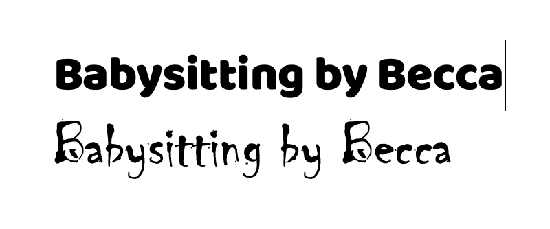
Nobody would respond to an ad with a scary movie vibe to watch their child.
Fun Combinations
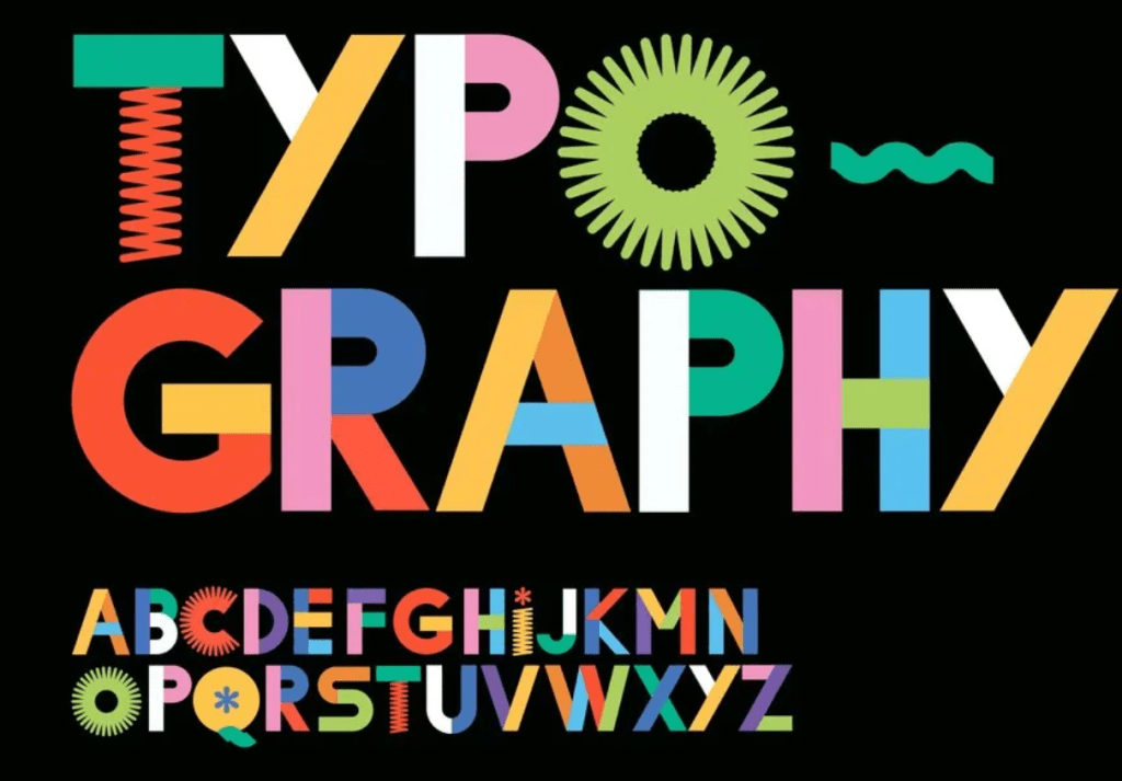
Combinations of different typefaces and fonts can prove to be very useful and effective. Different typefaces can introduce drama, they can identify different information, and even add texture to break up a block of text. However, Caldwell states that using two or three typefaces is probably enough and adding in too many different typefaces or fonts can create chaos (Caldwell, 69).
In addition, using typefaces in a less linear way can also prove to be very effective. For example, arranging the text in a creative way to further elicit the meaning can be very eye catching and fun. For example, creating text as a visual representation of its meaning can be extremely effective and can open the door to endless possibilities.
The amount of creativity in typefaces, fonts, and how they are arranged is limitless.
What I’m working on
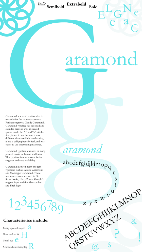
I chose to explore the Garamond typeface and further research the history and usage. I was thoroughly surprised to learn of its origins in sixteenth century France. This is a typeface that I always gravitate towards because I love its clear letters and sophosticated tone. I even used the word “elegance” as an example of the typeface in the type speciman below. The fact that it is used in many different mediums such as Harry Potter and in Abercrombie and Fitch ads proves its great versatility.
In further exploring typefaces in the medium of typefaces and logo design, I created a business identification system for my own personal training business. I started this business eight years ago and have done very little advertising over the years. I always had referrals and never needed to create business cards or advertising materials. However, exploring the consistency when creating stationary, business, cards, and posters helped me find a new color palatte, typeface, logo, and design style. I also enjoyed finding creative ways to spread the word such as custom waterbottles which would provide free advertising when my clients bring them to other classes and venues.
Even if you are not actively advertising, having a consistent typeface and logo on all business materials can provide a more professional image and lead to new growth and possibilities.
The true test will be implementing my new logo and advertising information on my website and starting my social platform with these creative assets.

Citations:
Caldwell, C. (2019). Graphic design for everyone. Dorling Kindersley Limited.
Cinelli, M. (2016, April 19). The power of typography | Mia Cinelli | tedxuofm. YouTube. https://www.youtube.com/watch?v=C_RzDqgGcao

Leave a comment